De-constructing Magazines
As we were set a task to do-construct 2 magazines, I chose a ‘We Love Pop’ magazine and a ‘Mojo’ magazine. This is because I am still uncertain on what genre of my magazine will be based on and therefore I wanted to explore different types of magazines and gather ideas.
'We Love Pop.'
· Bright Title-attracts more customers
· Use of stereotypically feminine colours such as pink could suggest that the target audience for this magazine and girls.
· Consistency of colours- a limited number of colours have been used throughout instead of having random colours, and this makes it look more organised and neat. In fact colours such as pink and white have been used throughout, even on the articles.
· The title is in black, standing out from the white background and personally this caught my attention straight.
· The main image is of ‘One Direction’ and their fan base is mainly young teenage girls and therefore this means that the magazine is most likely aimed at young teenage girls. Other images of artists such as ‘Cher Lloyd’ and the main fan base for Cher is also mainly young teenagers. Also, the clothes worn by the artists are also the colour of some text; again showing continuity and allowing the magazine cover to flow.
· The main image is very clear, stands out and eve catching.
· Different font sizes and colours have been used but in a controllable way( there are a limited number of font types and colours used on text-not completely random)
· Possibly the brighter and bolder writing could be more important and therefore these colours could have been used to catch the attention of the audiences straight away.
· All of the information has been laid out in the neatest was possible in different sections to avoid the scruffy look.
· They have tried to make their magazine more noticeable by adding extra information such as ‘Winter Hot List-Style Steals’ talking about fashion... making the audience feel like they are getting more then then expect
· The cost of the magazine is acceptable (£2.99) however bearing in mind that the target audience is teenagers, if it was for example £2 then more customers are likely to purchase it, as they’re normally using money from their parents and therefore it likely that they don’t have large amounts of money.
· The information that this magazine consists of is generally the most popular artists in the contemporary UK and therefore their magazines are generally sold in stores such as Tesco or corner shops, where many people would notice it.
· http://www.welovepopmag.co.uk/magazine is the official website for the magazine online. The theme has been continued on the website too...showing that there is a constant theme that the magazine sticks to. They have lots of information about the magazine online.
'MOJO'

· In comparison to ‘We Love Pop’ Magazine, ‘Mojo’ is completely different and as I am not yet sure about what my magazine genre is going to be based on, I decided to look at different magazine types.
· It is much duller and doesn’t use many colours. This could be seen as ‘boring’ but could also be seen as ‘mature’ and therefore its target audience could be adults.
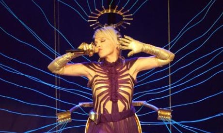
· There are 2 images on the cover. The main image is of a man holding a guitar, and he could be reflecting the target audience the magazine is for (middle-aged adults).
· The Orange coloured writing is likely to be more important than the rest and the colour can be used to make that specific information stand out more.
· The other image is of two men, and they’re also older men, supporting my idea of the target audience being older then the audience for the ‘We Love Pop’ magazine.
· ‘SUP POP’ is written in orange and this could mean that there is a small group within society that listen and believe in a different type of pop, also possibly being their target audience.
M